Websites designed and built from scratch, so they look good and work on every screen
I design and build every site myself, so what I design is what gets built. Each site below is hand-coded with HTML, CSS and JavaScript and responsive across desktop, tablet and mobile.
Get in touch
-
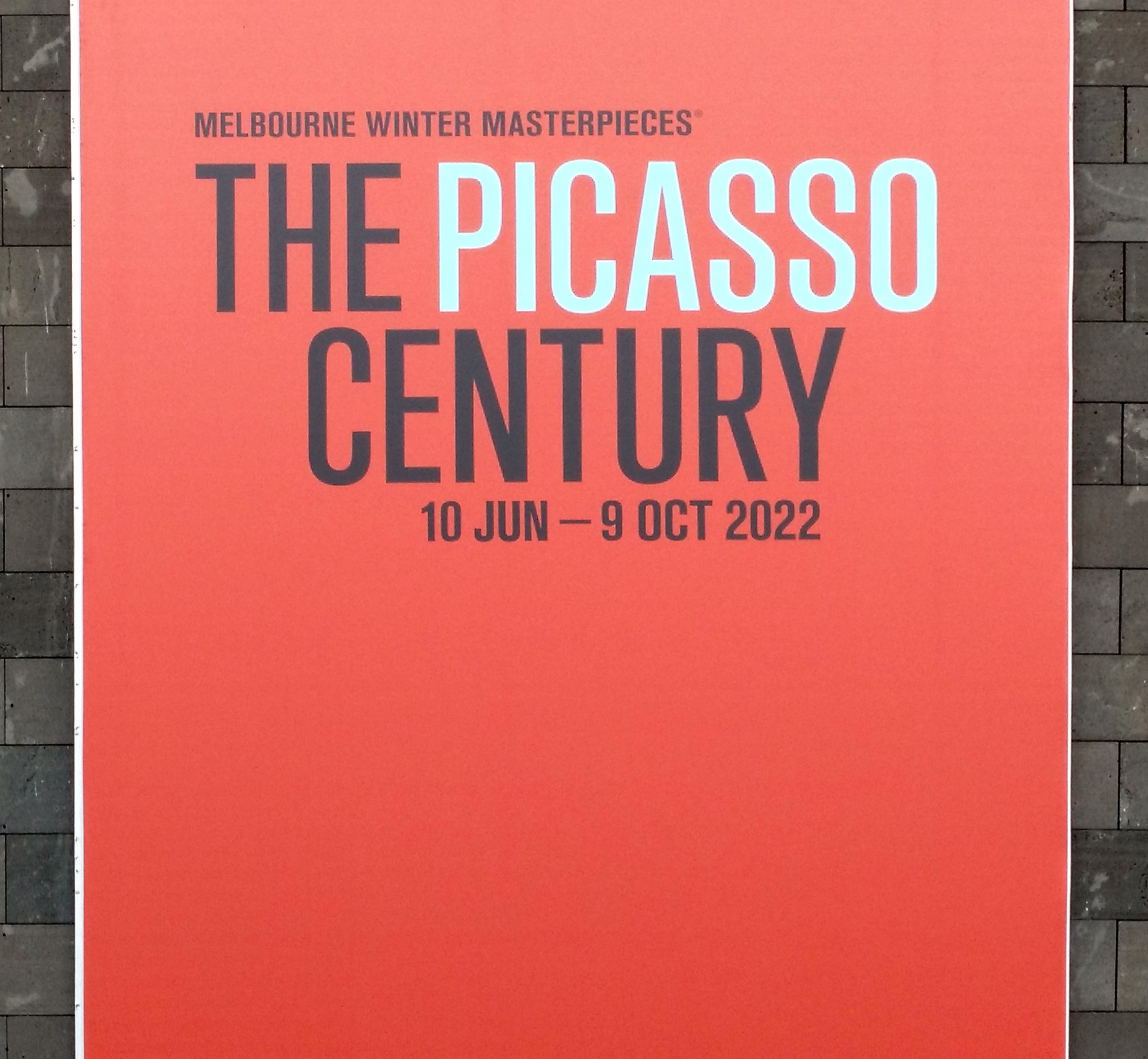
The Picasso Century: National Gallery of Victoria, Melbourne Winter Masterpieces
Designed and built by Sonia Becker. HTML, CSS, JavaScript. A responsive gallery that lets the artwork lead, with each piece shown in more than one view and a layout that works on desktop and mobile.
-
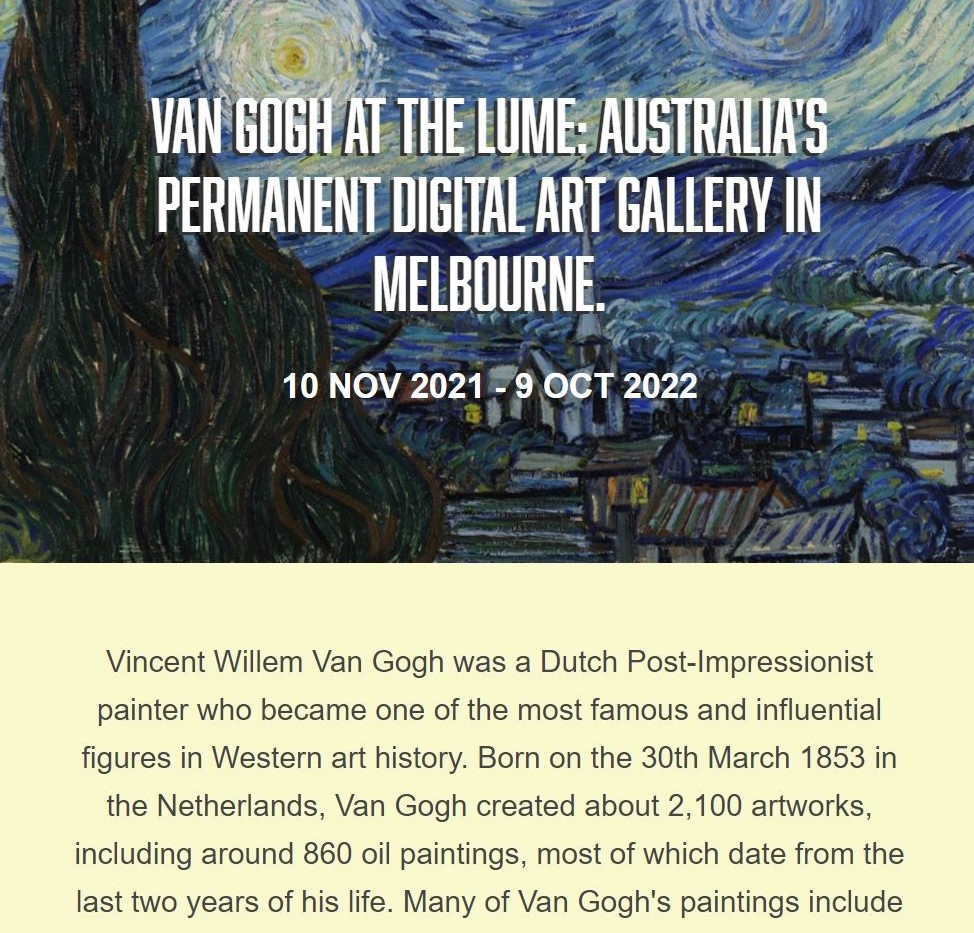
Van Gogh Digital Art Exhibition: The Lume, Melbourne
Designed and built by Sonia Becker. HTML, CSS, JavaScript. A website for Australia's permanent digital art gallery, designed to carry the immersive feel of the exhibition onto the screen, with large imagery and a layout that works on desktop and mobile.
-
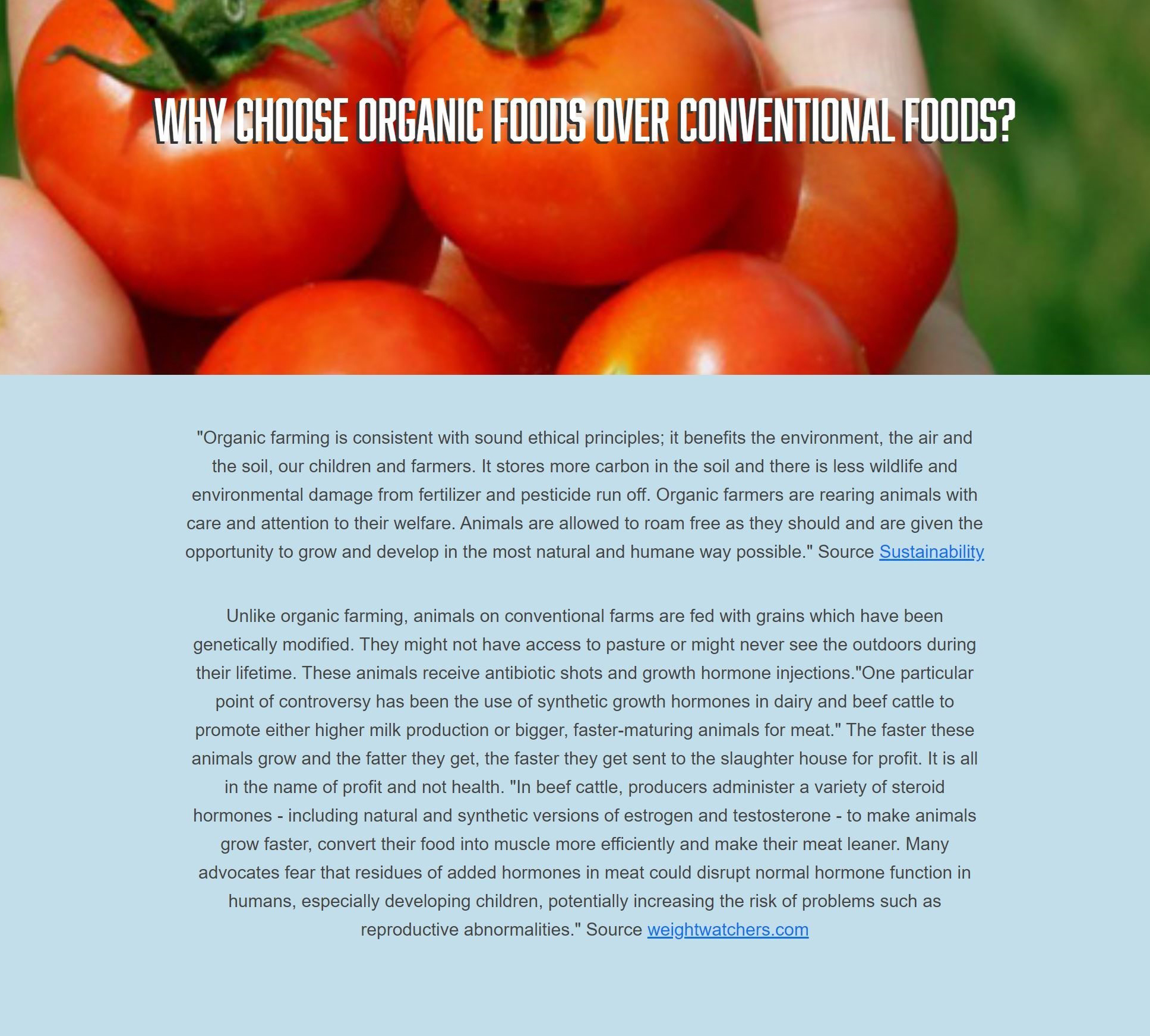
Organic: a content-led website on organic food
Designed and built by Sonia Becker. HTML, CSS, JavaScript. A content-led website on organic food, built around French consumer research, with clear navigation and a layout that works on desktop and mobile.
Written around French consumer research showing that organic products are now part of everyday life for most French people, especially under-35s (72% of 18-24s and 78% of 25-34s use them regularly). Translated into English from Études & analyses des marques et entreprises.
-
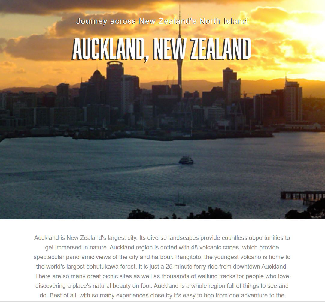
Auckland Tourist Attractions: a visitor guide website
Designed and built by Sonia Becker. HTML, CSS, JavaScript. A visitor guide to Auckland's attractions, designed so tourists can browse places quickly on any device.
Need a website?
Whether it's a new site or a refresh of an existing one, I can take it from concept to a finished, responsive build. This website is also designed and coded by me.
Contact me